Conversion focused web design is the practice of engineering every element of a website to guide visitors toward a specific action, whether that’s filling out a form, making a purchase, or picking up the phone. Most small business owners treat their website as a digital brochure. The ones who grow treat it as a sales system. The difference shows up in revenue. This article covers the core principles behind high conversion website design, including visual hierarchy, form optimization, page speed, trust signals, and mobile-first strategy, all backed by data and built for practical use.
How does conversion focused web design actually work?
Conversion rate optimization (CRO) is the recognized industry term for the discipline behind conversion focused web design. CRO treats every design decision as a testable hypothesis with a measurable outcome. A button color, a headline, a form field count — each one either moves a visitor closer to action or pushes them away. Visual hierarchy drives over 60% of conversion differences by directing where a visitor’s eye lands first. That single fact reframes the entire design process. You are not decorating a page. You are engineering attention.
Effective web design strategies start with understanding how people read online. Most visitors scan in an F-pattern or Z-pattern, moving left to right across the top, then dropping down the left side. Layouts that fight these natural reading flows lose visitors fast. Layouts that work with them keep visitors engaged and moving toward the goal. Every headline, image, and call to action should sit where the eye naturally travels.
Color contrast is one of the most misused tools in web design. A call-to-action button that blends into the page background is invisible to a scanning visitor. High contrast between the CTA and its surrounding area is not a style choice. It is a conversion requirement. Users form impressions of a website in as little as 50 milliseconds, which means your layout has less than a blink to communicate credibility and direction.
Pro Tip: Use gaze cueing in hero images. A photo of a person looking toward your CTA button draws the visitor’s eye in the same direction. It is a subtle but measurable technique used in landing page optimization.

How do forms and CTAs affect your conversion rate?
Forms are where most small business websites quietly lose leads. The fix is simpler than most owners expect. Reducing form fields from 4 to 3 can increase conversions by 50%. That is not a minor tweak. That is a structural change in how much friction you are asking visitors to push through.
The best practices for web conversion on forms and CTAs follow a clear pattern:
- Ask for the minimum. Name and email beat name, email, phone, company, and budget every time. Add fields only when the business genuinely needs that data before the first contact.
- Write benefit-driven CTA copy. “Get My Free Quote” outperforms “Submit” because it tells the visitor what they receive, not what they do.
- Place the primary CTA above the fold. Visitors should never have to scroll to find the first opportunity to act.
- Use one primary action per page. Giving visitors three CTAs creates decision fatigue. One clear path produces more completions than three competing options.
- Size and space tap targets correctly. On mobile, buttons smaller than 44×44 pixels are routinely missed or mis-tapped, which kills completions before they start.
Pro Tip: Add a single line of microcopy directly below your form submit button. Something like “No spam. We reply within one business day.” reduces hesitation and builds trust at the exact moment a visitor is deciding whether to click.
Why does page speed matter so much for conversions?
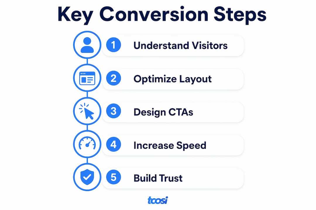
Page speed is not a technical detail. It is a conversion variable with a direct dollar value. Every 100ms reduction in load time correlates with a 1.11% increase in conversions. Sites that load in 1 second convert three times higher than sites that load in 5 seconds. For a small business generating leads online, that gap is the difference between a site that pays for itself and one that does not.
Google’s Core Web Vitals framework gives designers three measurable targets: Largest Contentful Paint (LCP), Interaction to Next Paint (INP), and Cumulative Layout Shift (CLS). LCP measures how fast the main content loads. INP measures how quickly the page responds to a click. CLS measures whether elements jump around as the page loads. All three affect both search rankings and user experience. Failing them costs you traffic and conversions at the same time.
The 2-second interactivity rule is the gold standard for engagement. If a visitor cannot interact with your page within two seconds of arrival, a measurable share will leave before they see your offer. Faster website speed also directly improves SEO rankings, compounding the conversion benefit with more organic traffic.
Key performance practices worth building into every project:
- Compress and serve images in modern formats like WebP
- Defer non-critical JavaScript so it does not block the initial render
- Use a content delivery network (CDN) to serve assets from servers close to the visitor
- Prioritize loading the hero section first, since that is what visitors see and judge immediately
- Choose lightweight page-building frameworks over feature-heavy ones that load dozens of unused scripts
What trust signals actually increase conversions?
Trust is a design problem. Visitors who do not trust your site will not convert, no matter how good your offer is. The good news is that trust can be built visually, and the placement of trust signals matters as much as their presence. Placing trust signals like Google review stars within 200 pixels of a CTA button can increase click-through rates by 12–34%. That is a significant lift from a single layout decision.
The most effective trust signals for small business websites include:
- Star ratings and review counts from Google, pulled directly onto the page near your primary CTA
- Named testimonials with a photo and job title, not anonymous quotes
- Security badges on any page that collects personal or payment information
- Professional photography that shows real people, real locations, and real work. Generic stock photos signal inauthenticity and reduce trust.
- Certifications and affiliations relevant to your industry, displayed near the footer or contact section
Consistent branding also functions as a trust signal. When fonts, colors, and photography style stay consistent across every page, visitors subconsciously read the site as credible and organized. Inconsistency reads as carelessness.
Accessibility is a trust and usability factor that most small business sites ignore until it becomes a legal issue. Integrating WCAG 2.2 compliance from the start costs a fraction of retrofitting it later. Early integration also improves the experience for every visitor, not just those with disabilities. You can learn more about website accessibility requirements and why they matter for your business.
Pro Tip: Place your most credible trust signal, whether that is a review count, a certification logo, or a client name, within the same visual block as your primary CTA. Proximity between proof and action is what drives the conversion lift.
How does mobile-first design improve your conversion rate?
Mobile is where most of your visitors arrive. Designing for desktop first and shrinking it down for mobile is a reliable way to produce a site that looks fine on a laptop and frustrates everyone on a phone. Mobile-first design flips that process. You build for the smallest screen and the most constrained conditions first, then expand for larger devices.
Primary CTAs placed in the thumb zone, the bottom 40% of the screen, improve mobile conversion rates by 23%. Most visitors hold their phone with one hand. A button at the top of the screen requires an awkward reach. A button at the bottom is effortless to tap. That single placement decision produces a measurable conversion difference.
Mobile-specific design decisions that consistently improve results:
- Use full-width forms so input fields are easy to tap and fill
- Keep text at a minimum of 16px so visitors do not need to pinch and zoom
- Simplify or remove large hero images on mobile to bring the CTA into view without scrolling
- Avoid intrusive pop-ups that cover the screen on mobile, since Google penalizes these and visitors close them immediately
- Use single-column layouts that follow a vertical scroll story, guiding the visitor from problem to solution to action
For a deeper look at mobile-friendly design tactics, the principles above translate directly into higher engagement and more completed forms. Authentic, well-chosen images also play a role in mobile performance. The role of images in conversion is worth understanding before you finalize any mobile layout.
Key Takeaways
Conversion focused web design produces measurable results when visual hierarchy, form simplicity, page speed, trust signals, and mobile-first layout work together as a single system.
| Point | Details |
|---|---|
| Visual hierarchy drives conversions | Over 60% of conversion differences come from how well layout directs visitor attention. |
| Fewer form fields mean more leads | Cutting from 4 to 3 fields can increase form completions by 50%. |
| Speed is a conversion variable | Sites loading in 1 second convert 3 times higher than those loading in 5 seconds. |
| Trust signals need proximity | Placing reviews or badges within 200 pixels of your CTA increases clicks by up to 34%. |
| Mobile placement changes outcomes | Thumb-zone CTA placement improves mobile conversion rates by 23%. |
What I’ve learned about conversion design that most articles skip
The biggest myth I see repeated is that a beautiful website automatically converts well. It does not. I have worked on sites that looked polished and performed poorly, and I have seen plain, well-structured sites outperform them consistently. The difference is always in the engineering: where the CTA sits, how fast the page loads, how many fields the form asks for, and whether a visitor can find the next step without thinking.
The second thing most articles skip is that a website is never finished. The best-performing sites I have worked on went through multiple rounds of testing and adjustment after launch. A headline change, a button color swap, a trust signal moved closer to the form. None of those changes are dramatic. All of them add up. If you treat your website as a completed project the day it goes live, you are leaving conversions on the table every month. Ongoing optimization is what separates a site that grows with your business from one that stagnates.
The third thing worth saying plainly: accessibility is not optional, and it is not just a legal checkbox. Building with WCAG compliance and inclusion in mind from day one makes your site better for every visitor. It also costs far less than fixing it after the fact. I build accessibility into every project from the start because it is the right way to build, and because it produces better results.
— Tommy Cosimano
How tcosi can help you build a site that converts
If you have read this far, you already know that conversion focused design is more than picking colors and fonts. It requires deliberate decisions about layout, speed, trust, and mobile experience working together from the start.
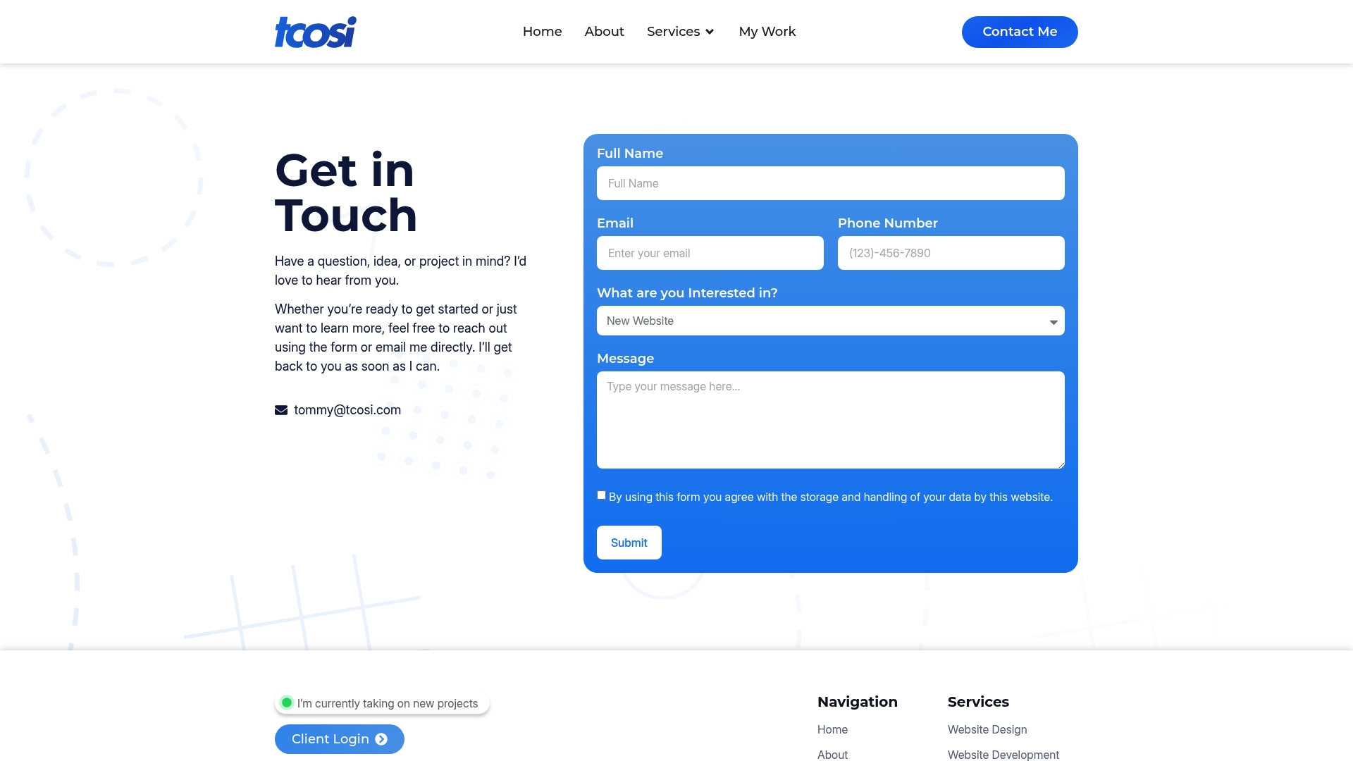
tcosi builds custom WordPress websites designed around your business goals, not just your brand aesthetic. Every project includes performance optimization, mobile-first layout, and conversion-focused structure built in from day one. Whether you need a new site, a redesign, or ongoing support to keep your site growing, tcosi handles the technical side so you can focus on running your business. Reach out to start a conversation about what your site could be doing better.
FAQ
What is conversion focused web design?
Conversion focused web design is the practice of structuring every website element, including layout, copy, forms, and speed, to guide visitors toward a specific action like a purchase or inquiry.
How much does page speed affect conversions?
Sites loading in 1 second convert three times higher than sites loading in 5 seconds, and every 100ms reduction in load time adds a 1.11% conversion increase.
Where should I place my CTA on a mobile site?
Place your primary CTA in the bottom 40% of the screen, known as the thumb zone. Research shows this placement improves mobile conversion rates by 23%.
How many fields should a contact form have?
Three fields or fewer produces the highest completion rates. Reducing from 4 to 3 fields can increase conversions by 50%, so ask only for what you genuinely need before the first contact.
Do trust signals really change conversion rates?
Yes. Placing trust signals like Google review stars within 200 pixels of your CTA button can increase click-through rates by 12–34%, making placement as important as the signal itself.