Investor-ready website design is the practice of building a site that communicates credibility, clarity, and traction to potential investors within seconds of their first visit. This is not a cosmetic upgrade. It is a core business asset that works around the clock to shape how investors perceive your company before you ever get on a call. Understanding why websites need investor-ready design means recognizing that investors conduct unannounced due diligence through your site, using its quality as a direct proxy for your leadership’s execution ability. Your website is often the first and most lasting impression you make on the people who could fund your growth.
Why websites need investor-ready design: the credibility engine
Your website functions as a silent co-founder, communicating your company’s story, discipline, and market position without you in the room. Investors do not wait for a pitch deck to form opinions. They visit your site first, and they decide fast.
A poorly designed site does not just look bad. It signals to investors that your team may lack the execution discipline needed to build a real business. Consistency in typography, navigation, and content builds credibility more effectively than budget size alone. A clean, well-organized site tells investors that you pay attention to details, and that matters when they are deciding whether to trust you with capital.

The standard industry term for this practice is “investor relations web design,” but most founders encounter it as investor-ready design. Both refer to the same goal: a site that converts a skeptical visitor into a curious, engaged investor. The difference between a site that earns a follow-up meeting and one that gets closed in 10 seconds often comes down to three things: clarity of message, proof of traction, and professional execution.
What key features make a website investor-ready?
Investor-friendly website features fall into two categories: what you say and how you say it. Both matter equally.
What your site must communicate:
- A specific, concrete value proposition. “We help small retailers increase sales by 30%” outperforms “We empower businesses to grow” every time. Specificity in value propositions consistently outperforms generic claims with investor audiences.
- Visible team bios with real credentials and links to professional profiles. Investors back people first, ideas second.
- Quantitative traction proof. Monthly active users, revenue milestones, pilot programs, and waitlist numbers all signal real market demand.
- Social proof in the form of client testimonials, press mentions, or named partnerships.
- Clear, minimal calls to action that guide investors toward a specific next step, whether that is scheduling a call, downloading a deck, or joining a waitlist.
How your site must present itself:
- Fast load times. Slow pages suggest technical debt and poor prioritization.
- Mobile responsiveness. A site that breaks on a phone signals that your team does not test its own product.
- Consistent branding across every page. Mismatched fonts, colors, or tone create subconscious doubt.
- Simple, logical navigation. If an investor cannot find your team page or your product description in under 30 seconds, you have lost them.
Pro Tip: Run your site through Google PageSpeed Insights before any investor outreach. A low performance score is the kind of detail that kills credibility quietly.
How does traction proof change investor perception?
Traction signals are the single most persuasive element on an investor-ready site. Numbers consistently outperform adjectives for building investor confidence, and that principle applies directly to your website copy.
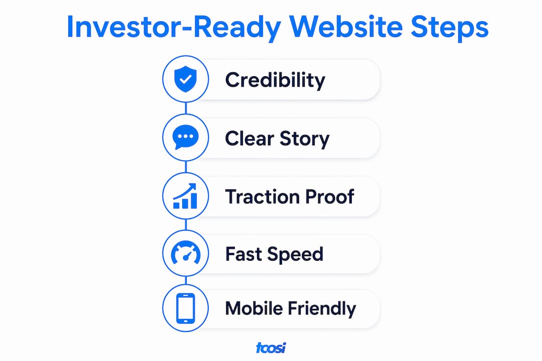
Investors in 2026 expect quantitative evidence. They want to see pipeline velocity, customer acquisition cost, conversion rates, and active user counts. These are not metrics you save for a data room. They belong on your homepage and your product pages, presented plainly and without spin.
| Traction Signal | What It Tells Investors |
|---|---|
| Monthly active users | Real market demand exists beyond early adopters |
| Revenue growth rate | The business model is working and repeatable |
| Beta or pilot programs | Product is past concept stage and in real use |
| Waitlist size | Demand exceeds current supply, a strong signal |
| Customer acquisition cost | Team understands unit economics and can scale |
Clean UX and fast performance reinforce these numbers. Investors use site speed and mobile responsiveness as proxies for operational maturity. A site that loads slowly or breaks on mobile suggests that the same sloppiness may exist in your operations. The design and the data work together to tell one story: this team executes.
Pro Tip: Place your single strongest traction metric in the hero section of your homepage. Do not bury it in an “About” page. Investors should see proof before they see your pitch.
Knowing how to measure website success with the right KPIs also helps you identify which traction numbers are worth featuring and which ones need more time to develop before you put them front and center.
What mistakes do founders make with investor-ready design?
The most common mistake is building a site for customers and assuming it works for investors too. It does not. Investor audiences read differently, look for different signals, and have different questions.
Here are the pitfalls that cost founders the most:
- Vague or technical language. Investors are not always domain experts. If your homepage requires a PhD to understand, you have already lost the room. Experts recommend focusing on clarity and differentiation with language that any outsider can grasp.
- Standalone “Investor Relations” pages. Hiding investor content behind a separate tab signals that your commercial story is not strong enough to stand on its own. Embed investor-focused content into your core site instead.
- Feature lists without business context. A list of product capabilities means nothing without connecting each feature to a real customer outcome or revenue impact.
- Design flashiness without narrative. Animations and visual effects do not replace a clear problem-solution story. Websites described as “credibility engines” win over sites that prioritize aesthetics over message.
- Ignoring technical basics. Broken links, slow load times, and inconsistent branding are the fastest ways to lose an investor’s trust without saying a word.
For fintech founders and others in regulated industries, the bar is even higher. Investors in high-stakes sectors look for compliance awareness and plain-language product descriptions as trust signals, not just polished visuals.
How do you implement investor-ready design on your site?
Auditing and redesigning your site for investor appeal does not require starting from scratch. It requires a clear framework and disciplined execution.
- Start with your messaging. Write your homepage headline around the market problem you solve, not the features you offer. Follow it immediately with your solution and your strongest traction number.
- Build a credible team section. Include photos, titles, relevant experience, and links to LinkedIn profiles. Investors want to know who they are backing before they read anything else.
- Optimize for speed and mobile. Use a performance-tested WordPress theme or a well-coded custom build. Check your site on multiple devices and browsers before any outreach. Following local business website best practices gives you a solid technical foundation to build on.
- Place metrics strategically. Feature your best traction numbers on your homepage, your product page, and any case study pages. Do not scatter them randomly or hide them in blog posts.
- Simplify your CTAs. One primary call to action per page. For investor-facing pages, that action should be scheduling a call, not signing up for a newsletter.
- Conduct an investor audit. Visit your own site as if you are a skeptical investor with 60 seconds to spare. Ask: Do I understand what this company does? Do I believe they are gaining traction? Do I trust this team? If the answer to any of those is no, you have work to do.
Pro Tip: Use your website launch checklist as a baseline audit tool. Many investor-ready requirements overlap with professional launch standards.
Building trust online through consistent design, transparent team presentation, and clear social proof directly supports the credibility investors are looking for when they evaluate your site.
Key Takeaways
An investor-ready website is the most cost-effective credibility tool a founder can build, because it works every hour of every day without you in the room.
| Point | Details |
|---|---|
| First impressions are decisive | Investors judge execution capability from site quality before reading a word of copy. |
| Specificity beats vague claims | Concrete value propositions and real traction numbers outperform generic marketing language. |
| Technical quality signals discipline | Fast load times, mobile responsiveness, and consistent branding reflect operational maturity. |
| Embed investor signals in your core site | Standalone investor pages hide your story; integrate credibility signals throughout the site. |
| Audit from an investor’s perspective | Review your site as a skeptical outsider every quarter to catch gaps before investors do. |
What I have learned from building sites that attract investors
I have worked with founders who had genuinely great businesses but websites that made them look like side projects. The disconnect was not intentional. They built their sites for customers, which makes sense early on. But the moment they started pursuing funding, that same site became a liability.
What I have found is that the founders who get the most investor traction from their websites are not the ones with the biggest design budgets. They are the ones who are ruthlessly clear. They know exactly what problem they solve, who they solve it for, and what proof they have that it is working. And they put all of that on the homepage, above the fold, in plain language.
The misconception I see most often is that an investor-ready site needs to look expensive. It does not. It needs to look intentional. A site that loads fast, tells a clear story, and shows real numbers will outperform a visually stunning site with vague messaging every single time. I have seen it happen repeatedly.
The other thing I want founders to understand is that your website is not a fundraising artifact. It is a living business asset. The habits you build around keeping it updated, accurate, and technically sound are the same habits that will serve you long after the funding round closes. Treat it that way from day one.
— Tommy Cosimano
How tcosi helps you build a site investors take seriously
If you have read through this and realized your current site is not doing the work it should, you are not alone. Most business owners and founders reach that point eventually.
tcosi builds custom WordPress websites designed to communicate credibility, tell a clear story, and hold up under scrutiny. Whether you need a full redesign or a focused audit and refresh, the work starts with understanding your business and what you need your site to do. If investor-ready design is the goal, that shapes every decision from messaging to layout to performance. You can learn more about WordPress development services or reach out directly to talk through what your site needs.
FAQ
What is investor-ready website design?
Investor-ready website design is the practice of structuring a website to communicate credibility, traction, and a clear value proposition to potential investors. It combines professional design with commercially oriented messaging and quantitative proof of business progress.
What do investors look for on a startup website?
Investors look for a specific value proposition, visible team credentials, quantitative traction signals like active users or revenue growth, fast performance, and a clear call to action. Sloppy websites create doubt about execution capability without a word being said.
Should I create a separate investor relations page?
No. Embedding investor-focused content throughout your core site is more effective than isolating it on a standalone page. Commercially oriented language with evidence of current users and outcomes performs better than a dedicated investor section.
How does site speed affect investor perception?
Site speed is a direct signal of technical discipline. Investors treat slow-loading pages as evidence of poor prioritization, which raises questions about how the team manages its product and operations overall.
How often should I update my investor-ready website?
Update your site whenever your traction numbers, team, or product offering changes. A site with outdated metrics or stale content signals that the business has stalled. Ongoing updates are part of maintaining website credibility over time.