A website style guide is a single document that holds the colors, type, UI patterns, and writing rules a team uses to keep every page consistent. It saves designers and writers from relitigating the same decisions on every project, and it helps developers ship faster because the rules already exist. The real payoff is fewer accessibility regressions and a site that feels like one product, not ten.
TL;DR:
- A style guide suits small teams, static sites, and fast MVPs; choose a design system when several products need shared coded components and governance.
- Name colors, spacing, and type as design tokens first, so a lightweight guide can grow into a system without renaming its foundations.
- Assign one owner, keep current values in a single source, and label patterns stable, experimental, or deprecated to prevent silent inconsistencies.
- Build accessibility into component patterns, then test pages with open ended, information seeking tasks to check comprehension; overlays cannot replace accessible design.
- Start with the colors, type, and components the site already uses; documenting nonexistent patterns adds scope without helping future contributors.
Table of Contents
- Checklist: the essential components of a website style guide
- Style guide vs. design system: how to choose the right scope
- Examples and tools: pattern libraries and places to learn from
- Governance and maintenance: keeping the guide accurate
- Accessibility and content testing: what to document and verify
- Lean rollout workflow: from audit to published guide
- How a website design and development agency might approach style guides on real projects
- Why we treat a style guide as living documentation
- How we can help you build and maintain your style guide
- FAQ
- Sources
Checklist: the essential components of a website style guide
A usable style guide covers four layers: the visual foundation, the UI patterns built from it, the editorial rules that shape the words, and the assets that let people actually implement all of it. Skip any layer and someone on the team will improvise, which is exactly what the guide exists to prevent.
- Visual foundation: brand colors and color tokens, a typography scale, spacing units, and elevation or shadow rules.
- UI patterns: navigation, buttons, forms, cards, lists, and page templates, each with a short note on when to use it and when not to.
- Editorial standards: voice and tone guidance, heading rules, link style, microcopy templates, and metadata conventions.
- Assets and code: design tokens, a Figma component library, Storybook examples, and CSS variable or CSS-in-JS guidance.
- Accessibility baseline: contrast pairs, keyboard behavior notes, ARIA guidance, and alt text rules for images.
- Deliverables: a downloadable tokens file, copyable component snippets, an editable Figma library, and a short contributor guide.
We lean on color and contrast guidance and a defined typography scale early in every project, because those two decisions touch almost every other pattern in the guide.
Style guide vs. design system: how to choose the right scope
A style guide documents the rules: colors, type, voice, and basic patterns. A design system goes further, bundling those rules with reusable, coded components, documentation, and governance standards that scale across teams.
A style guide is enough for a small team, a mostly static site, or a fast MVP where speed matters more than perfect component reuse. A design system earns its cost when several products or platforms need to share the same building blocks and a mismatch would actually confuse customers. Design tokens are the bridge between the two: start by naming your colors, spacing, and type as tokens, and you can grow from a lightweight guide into a full system later without renaming anything.

Examples and tools: pattern libraries and places to learn from
Studying a few real guides is faster than guessing at structure from scratch. The US Web Design System is worth a close look for its accessible, mobile-first components and the way it documents usage rules alongside code. Institutional and voice-focused guides are useful for editorial structure, since they show how tone rules get translated into actual sentence-level guidance rather than vague adjectives.
For production, a small set of tools covers most needs:
- Figma for the visual component library and spacing or type specimens.
- Storybook for interactive, developer-facing component documentation.
- A design-tokens file in JSON or CSS custom properties, following patterns like the VA Design System’s token structure.
- MDX or a simple docs site for the written rules, so content and code live close together.
Match the example to your stack: a static marketing site needs a simpler guide than a component-driven app, and copying a federal agency’s full governance model onto a five-page brochure site is overkill.
Governance and maintenance: keeping the guide accurate
A style guide without an owner drifts within a few months. The fix is a single source of truth: one place, usually a tokens file plus a documented component library, where every current value lives, with one person or small group responsible for changes.
A simple tier model helps teams know what they can rely on: core patterns that are stable and safe to reuse everywhere, experimental patterns still being tested, and deprecated patterns scheduled for removal. Pair that with a contribution workflow, so a new button variant or a copy change goes through a ticket or pull request and gets reviewed before it ships, rather than appearing quietly on one page.
A short change log matters more than most teams expect. When a token value or a component behavior changes, a brief note that reaches designers and developers at once prevents the awkward moment where half the site updates and half doesn’t.
Accessibility and content testing: what to document and verify
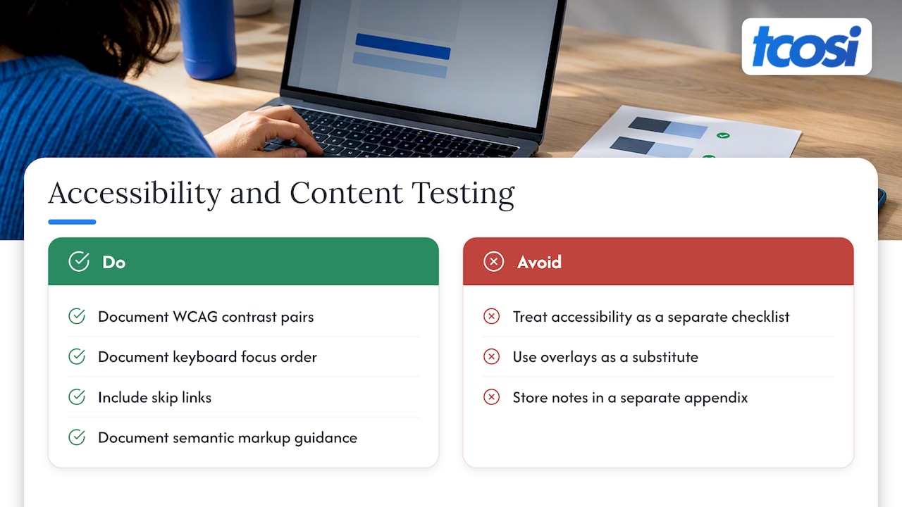
Bake accessibility into the patterns themselves rather than treating it as a separate checklist. Document contrast pairs that meet WCAG thresholds, keyboard focus order, skip links, and semantic markup guidance for headings, lists, and landmarks, so every contributor builds accessible components by default.
Testing matters as much as documentation, which is why tools for enhancing user experience for greater SEO success become invaluable in this phase. Nielsen Norman Group recommends open-ended, information-seeking tasks when testing content, since they reveal whether people actually understand a page rather than whether they can locate one fact. Accessibility overlays and widgets are not a substitute for this work: accessible design has to be built in from the start, not patched on afterward. Store accessibility notes and code snippets next to each component in the guide, not in a separate appendix nobody opens.
Lean rollout workflow: from audit to published guide
A style guide gets built in stages, and skipping the early ones is the most common reason guides stall halfway through.
- Audit and inventory: catalog existing pages, components, tokens, and content samples, including inconsistencies you want the guide to fix.
- Define foundations: lock in colors, a type scale, spacing units, and consistent token names before touching components.
- Build artifacts: assemble the Figma library, the tokens file, working component examples, and editorial templates.
- Test and iterate: run task-based tests with real users, check accessibility against your documented baseline, and fix gaps before publishing.
- Publish and onboard: document how contributions are proposed and reviewed, and set a schedule for who checks the guide and when.
A requirements document built during the audit phase gives the whole team a shared starting point instead of five different mental lists.
Pro Tip: Freeze your foundation tokens before you build a single component; renaming a color variable after ten components reference it costs far more time than getting the name right on day one.
How a website design and development agency might approach style guides on real projects
A usual approach starts with a minimum viable style guide: core colors, type, and the handful of components a site actually uses, rather than documenting patterns that don’t exist yet. This keeps scope tight and can accelerate stakeholder sign-off. Collecting feedback with short, structured review templates that ask specific questions instead of open “thoughts?” requests can shorten review cycles. Typical handoffs often include the style guide document, a tokens file, an editable Figma library, and ready-to-use component snippets.
Why we treat a style guide as living documentation
A style guide earns its cost the moment a second person touches the site, because it turns dozens of small decisions into one reference instead of a guessing game. Teams that treat it as a one-time deliverable watch it go stale within a year, which defeats the point entirely.
The better habit is to treat it the way you’d treat any other piece of product documentation: reviewed on a schedule, updated when a pattern changes, and owned by someone who actually has time to maintain it. A style guide that nobody updates becomes a historical record of how the site used to look, which helps no one.
— Tommy Cosimano
How we can help you build and maintain your style guide
If you need a style guide built from scratch, our Style Guide package gives you a documented foundation of colors, type, and core components without the overhead of a full design system. For teams rebuilding a site around that foundation, our Website Design service brings the guide to life across real pages, and our Ongoing Maintenance plan keeps tokens, components, and content current as your site grows.

A good starting point is an audit call where we walk through your existing pages and flag the inconsistencies worth fixing first. From there we scope a style guide project sized to your site, not a generic template. Reach out through our pricing and packages page to see which option fits where you are right now.
FAQ
What is a website style guide?
A website style guide is a single reference document that defines a site’s colors, typography, spacing, UI components, and writing rules, so every page and every contributor stays consistent. It covers both visual standards and editorial guidance like tone, headings, and link style.
How do I style my website consistently across pages?
Start by locking down your color palette, type scale, and spacing units as named tokens, then build your buttons, forms, and navigation from those same values. Document each pattern with a short “when to use it” note so future contributors apply it the same way you intended.
What does a good style guide look like?
A strong style guide pairs a visual foundation (colors, type, spacing) with documented UI patterns, clear editorial rules, and real assets like a Figma library or a design tokens file. It also names an owner and a contribution process, so it stays accurate instead of going stale.
What is a website style description, and how does it differ from a design system?
A website style description, more commonly called a style guide, lists the visual and editorial rules for a site: colors, fonts, spacing, and voice. A design system goes further, adding reusable coded components, documentation, and governance standards meant to scale across multiple products.
How do design and content teams collaborate using a style guide?
Designers and developers typically share a tokens file and component library, while writers reference the same guide for voice, heading structure, and microcopy patterns. Routing changes through one contribution workflow, whether a design ticket or a pull request, keeps both groups working from the same current version.
Sources
- The difference between a design system and a style guide | zeroheight
- Testing content on websites | Nielsen Norman Group
- Design tokens | VA Design System