
What does typography actually do in web design?
Typography in web design is the strategic arrangement of text to make content clear, readable, and meaningful. It’s one of the most foundational decisions you’ll make for any website, and it affects far more than how things look.
Here’s what good typography actually does:
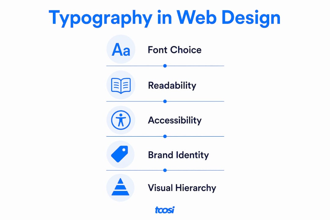
- Readability: It makes your content easy to read across all devices and screen sizes.
- Visual hierarchy: It guides visitors through your page, from headline to subhead to body copy, in a natural, intuitive order.
- Brand identity: Consistent typeface choices communicate your personality and build recognition over time.
- User experience: Clean, well-spaced text reduces friction and keeps people engaged longer.
When typography is done well, visitors don’t notice it. They just read. When it’s done poorly, they leave.
Table of Contents
- Key elements of typography in web design
- How typography enhances readability and accessibility
- How typography shapes brand identity and user experience
- How visual hierarchy guides users through your content
- Expert insights on effective typography in web design
- Key Takeaways
- FAQ
Key elements of typography in web design
Understanding the role of typography in web design starts with knowing what you’re actually working with. These are the building blocks:
- Typefaces and fonts: Your typeface is the family (like Georgia or Inter); the font is the specific style within it (bold, italic, 14px). Choosing web-friendly fonts means picking options that render cleanly across browsers and operating systems.
- Font size: A base size of about 16px works well for long-form reading. UI elements can go slightly smaller without sacrificing clarity.
- Font weight and style: Bold draws the eye. Italics add emphasis. Used together with restraint, they create contrast without clutter.
- Line height and letter spacing: Line height (the vertical space between lines) and letter spacing (the horizontal space between characters) both affect how comfortable text is to read. Tight spacing feels cramped; too loose and the eye loses its place.
- Color and contrast: Text needs enough contrast against its background to be legible. This isn’t just a design preference — it’s an accessibility requirement.
- Responsive behavior: Typography must adapt to different screen sizes. What reads well on a desktop can feel overwhelming on a phone if heading sizes and line lengths aren’t adjusted.
Pro Tip: Use CSS clamp() to scale font sizes fluidly between breakpoints. It saves you from writing separate media queries for every heading level and keeps your type feeling natural at any screen width.
How typography enhances readability and accessibility
Readability and accessibility aren’t the same thing, but good typography serves both at once. Legibility is about whether individual characters are distinguishable. Readability is about whether the text as a whole is easy to process. Both matter.

Accessible typography means choosing fonts that work for people with visual or cognitive disabilities, not just the average visitor. Fonts like Arial and Verdana are widely recommended because their letterforms are distinct and familiar, reducing the cognitive load required to parse them. Ornate or decorative fonts can be beautiful in a logo, but they create real barriers in body text for users with dyslexia or low vision.
Spacing plays a bigger role than most people expect. Generous line height, adequate letter spacing, and comfortable paragraph width all reduce eye strain and help users with attention or reading challenges stay on track. Avoiding justified text alignment is also worth noting: justified text creates uneven gaps between words, sometimes called “rivers of space,” that disrupt reading flow and are particularly difficult for users with disabilities.
Color contrast is where many sites fall short. Text that looks fine on a designer’s calibrated monitor can be nearly invisible for someone with color vision deficiency. The Web Content Accessibility Guidelines (WCAG) set minimum contrast ratios, and meeting them isn’t optional if you want your site to be genuinely inclusive. You can learn more about building inclusive sites in tcosi’s website accessibility guide.
Typography that works for people with disabilities almost always works better for everyone. Larger font sizes, clear spacing, and strong contrast don’t just help users with visual impairments — they make content easier to read in bright sunlight, on small screens, and during a quick scan. Accessibility and good design point in the same direction.
How typography shapes brand identity and user experience
Your typography is your brand’s voice in written form. A law firm using a clean serif like Georgia signals authority and tradition. A tech startup using a geometric sans-serif like Inter signals precision and modernity. Neither choice is wrong — but both are deliberate, and visitors pick up on them immediately.
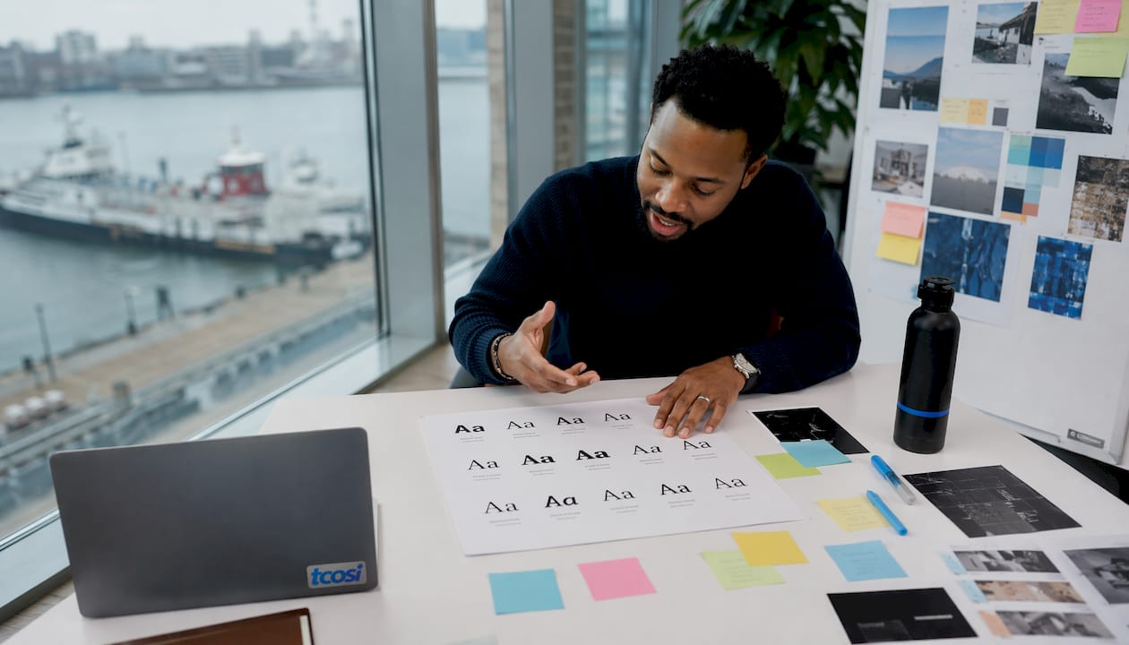
Consistent typeface use across your website, emails, social graphics, and print materials builds long-term brand recognition. When your fonts change from page to page or platform to platform, it creates a subtle sense of inconsistency that erodes trust. It’s the visual equivalent of a company that sounds different every time you call them.
The flip side is also true. Flashy or overly decorative fonts often undermine the very message they’re trying to support. When a font draws attention to itself, it pulls focus away from the content. The goal of typography isn’t to impress — it’s to communicate. A font that makes visitors stop and think “that’s an interesting typeface” has already failed its primary job.
Clean, readable typography also builds trust in a practical way. Visitors associate polished, consistent design with professionalism. A site with mismatched fonts, inconsistent sizing, or hard-to-read body text signals that details weren’t attended to — and that impression carries over to how people perceive the business itself.
How visual hierarchy guides users through your content
Visual hierarchy is the system that tells visitors where to look first, second, and third. Typography is the primary tool for building it. Without a clear hierarchy, every element on the page competes for attention equally, and the result is a page that feels chaotic and hard to navigate.
Size and weight do most of the heavy lifting. A large, bold H1 heading anchors the page and communicates the main topic. Smaller H2 and H3 subheadings break content into digestible sections. Body text sits at a comfortable reading size, clearly subordinate to the headings above it. This progression creates a natural reading path that guides user attention without requiring any conscious effort from the visitor.
Type scale progressions, where each heading level follows a consistent size ratio, give pages a sense of order and rhythm. Combined with adequate spacing between sections, a well-built type scale makes it easy for visitors to scan a page and understand its structure before they’ve read a single word. Color and contrast can reinforce hierarchy too — a bold blue link or a highlighted call-to-action draws the eye to the action you want visitors to take. For a deeper look at how color and typography work together, tcosi’s guide on color in web design covers the relationship well.
Text alignment matters more than it gets credit for. Left-aligned text is the default for good reason: it gives the eye a consistent starting point for each new line. Centered text works for short headlines but becomes difficult to track across multiple lines of body copy.
Expert insights on effective typography in web design
The best typographers and UI designers share a consistent philosophy: typography should be invisible. When it’s working, users don’t notice the fonts — they just absorb the content. When it fails, the font itself becomes the story.
Good typography acts as an invisible interface, serving the content without drawing attention to itself. That’s a harder standard to meet than it sounds. It means resisting the temptation to use an unusual typeface just because it looks interesting, and instead choosing the font that makes the content clearest.
Limiting font weights to 2–3 variants per project is a practical rule that most experienced designers follow. One weight for body text, one for headings, and occasionally a third for emphasis or labels. More than that and the visual system starts to feel noisy and unresolved.
For teams managing complex sites or design systems, design tokens offer a practical way to handle typography at scale. Storing font size, weight, line height, and letter spacing as named variables in your CSS means that a single update cascades across the entire site consistently. It’s the kind of detail that prevents the slow typographic drift that happens when a site grows without a system behind it.
Pro Tip: Before finalizing any typeface, test it at the sizes you’ll actually use it — not just in a type specimen. A font that looks elegant at display size can fall apart at 16px body text, and you won’t know until you see it in context.
Common mistakes worth avoiding include: using all caps in body text (it slows reading speed significantly), pairing two fonts with similar personalities (they compete instead of complement), and ignoring mobile type sizes (a heading that works at 48px on desktop can overwhelm a 375px screen). If your site is showing signs of these issues, tcosi’s list of signs your site needs a redesign is worth a read.
If you want your site’s typography built with this level of care and consistency, tcosi’s web design services are a good place to start.
Key Takeaways
Typography is the single most consistent factor affecting whether visitors read your content or leave, making it a foundational investment in any web design project.
| Point | Details |
|---|---|
| Typography guides user attention | Size, weight, and spacing create a visual path that leads visitors through content naturally. |
| Accessibility starts with font choice | Fonts like Arial and Verdana improve readability for users with disabilities and benefit all visitors. |
| Base font size matters | A base size of about 16px supports comfortable long-form reading across most screens. |
| Limit font weights | Using 2–3 font weight variants keeps UI clarity high and reduces visual noise. |
| Consistency builds brand trust | Matching typefaces across pages and platforms reinforces brand recognition over time. |
FAQ
What is the role of typography in web design?
Typography controls how text looks and reads on a website, covering font choice, size, spacing, and hierarchy. It shapes readability, guides navigation, and communicates brand personality to every visitor.
How does typography affect user experience?
Clear, well-spaced typography reduces friction and keeps visitors engaged. Poor font choices or inconsistent sizing create confusion and push people to leave before they’ve read your content.
How does typography work on the web technically?
Web typography relies on CSS properties like font-size, line-height, letter-spacing, and font-weight to control how text renders across browsers. Responsive techniques like clamp() allow font sizes to scale fluidly between screen sizes without separate breakpoints for every device.
What is the difference between a typeface and a font in web design?
A typeface is the overall design family, such as Helvetica or Georgia. A font is a specific instance within that family, such as Helvetica Bold at a specific size. Most web designers use the terms interchangeably, but the distinction matters when building a consistent type system.
Which fonts are best for web accessibility?
Widely recognized fonts like Arial and Verdana are strong choices for accessible body text because their letterforms are distinct and easy to distinguish. Ornate or script fonts create barriers for users with dyslexia or low vision and should be reserved for decorative use only.