The best nonprofit websites in 2026 do one thing exceptionally well: they make it easy for visitors to care and then act. Sites like Age of Union, WaterAid, the Obama Foundation, The Children’s Society, Farm Africa, Surfers Against Sewage, Eden Reforestation Projects, Waves for Water, and SolarAid have each built online presences that turn passive browsers into committed donors. What they share is not a single template or color palette. It is a clear commitment to storytelling, intuitive navigation, and donation pathways that never make a visitor work too hard.
A few things stand out across all of these leaders:
- Prominent donation CTAs placed in the main navigation and visible on every page, not buried in a footer
- Authentic photography and video that puts real people and real places front and center
- Mobile-first layouts with vertical scrolling, large tap targets, and fast load times
- Impact reporting that shows donors exactly where their money goes
- Simple, clear navigation that guides visitors from curiosity to commitment in as few clicks as possible
If you are building or improving a site for your organization, these are the benchmarks worth studying.
What features do the best nonprofit websites share?
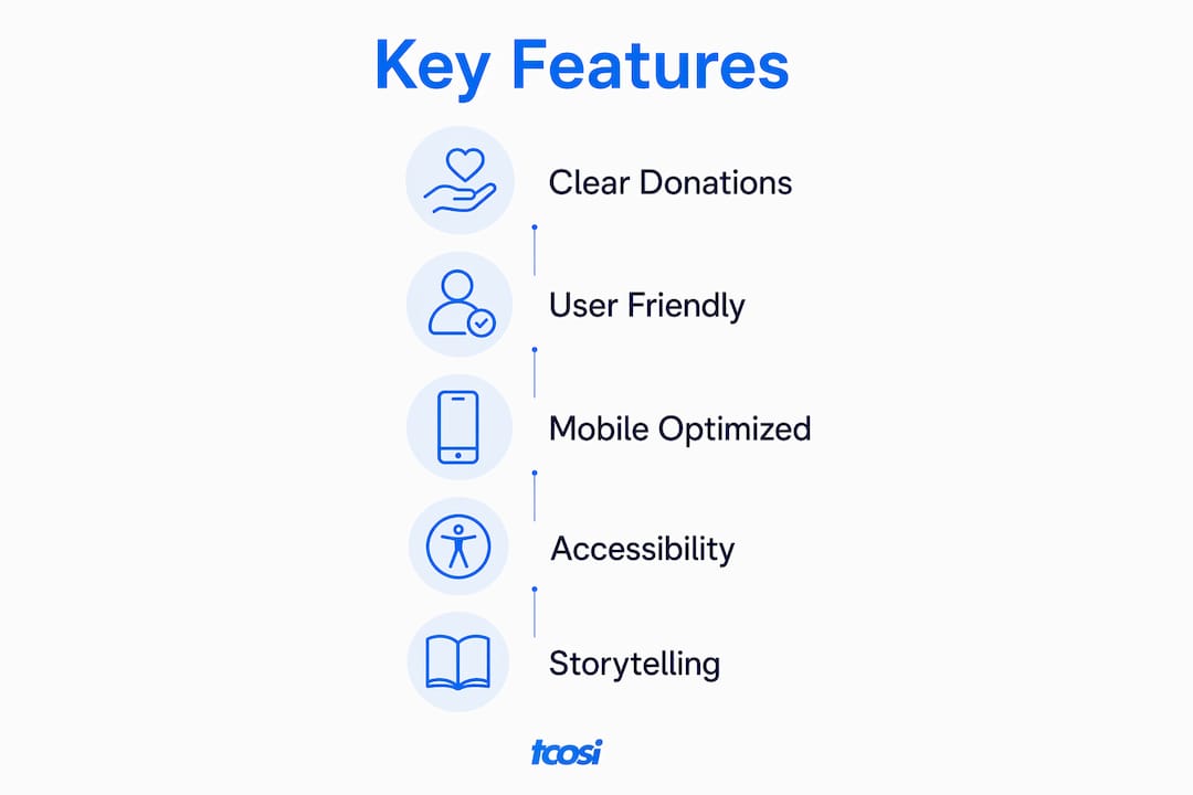
The nine pages every strong nonprofit site includes are: Homepage, About Us, Donate, Join/Get Involved, Events, News/Blog, Resources, Membership Area, and Contact Us. Each page has a job. The Donate page is not just a form; it is a conversion moment that needs to be frictionless, trustworthy, and emotionally resonant.
Beyond page structure, a few features separate good sites from great ones:
- Persistent donation button in the main navigation, visible on every page
- Mobile-optimized design with vertical layouts, larger fonts, and simplified menus
- SSL certificate and secure payment processing to protect donor data and build trust
- Matching gift widgets embedded in the donation flow so donors can check employer matches instantly
- Newsletter sign-up forms placed at high-traffic points to convert one-time visitors into ongoing supporters
- Accessibility features including screen reader support and sufficient color contrast
Pro Tip: Choosing a CMS built specifically for nonprofits, rather than a generic website builder, gives you donation processing, member management, and event registration out of the box. That saves time and reduces the risk of missing a feature that matters to donors.
Standout nonprofit websites in 2026: design and user experience

These six organizations demonstrate what excellent nonprofit web design looks like in practice.

| Organization | Homepage Layout | Donation Prominence | Storytelling | Mobile Optimized | Accessibility |
|---|---|---|---|---|---|
| Age of Union | Full-screen video hero | Top-nav CTA | Rich multimedia | Yes | High contrast, alt text |
| The Children’s Society | Bold imagery, clear mission | Persistent button | Case studies | Yes | Screen reader support |
| Farm Africa | Clean, photo-led | Above-the-fold CTA | Field photography | Yes | Color contrast compliant |
| WaterAid | Impact-first layout | Multiple CTAs | Data and stories | Yes | WCAG-aligned |
| Obama Foundation | Editorial, text-forward | Subtle but present | Long-form narrative | Yes | Strong semantic structure |
| SolarAid | Bright, energetic | Prominent donate link | Community impact | Yes | Alt text, readable fonts |
A few design and functional details worth noting across these sites:
- Age of Union uses cinematic video to place visitors inside conservation landscapes before asking for anything
- WaterAid pairs hard statistics with personal stories, giving donors both the rational and emotional case
- The Children’s Society uses case study pages that follow individual children over time, building a sense of ongoing relationship
- SolarAid’s site makes the math tangible: one solar light, one family, one specific cost
- Farm Africa leads with field photography that feels documentary rather than promotional
- The Obama Foundation leans into long-form editorial content, treating visitors as readers who want depth
Consistent branding using original photography and clean layouts is what gives each of these sites credibility on first contact.
Expert insights on pages and features that drive donations
Practitioners who work on nonprofit web development consistently point to a short list of priorities that move the needle on donations and donor retention.
- Integrate your site with a donor CRM. Mapping form submissions directly into a donor database eliminates manual data entry and makes personalized follow-up possible. Many organizations underestimate how complex this integration is, but getting it right pays off in donor lifetime value.
- Add matching gift tools to your donation page. Nonprofits that embed matching gift tools in the donation flow often see a meaningful increase in average gift size because donors can double their impact without extra effort.
- Use newsletter sign-ups as a retention tool. A newsletter subscription box converts one-time visitors into ongoing supporters with minimal ongoing effort.
- Keep your Donate page short. Fewer form fields mean higher completion rates. Ask only for what you need to process the gift and send a receipt.
- Show impact on the confirmation page. After a donation is processed, tell the donor exactly what their gift will do. That moment of gratitude and specificity drives repeat giving.
The organizations that treat their website as a relationship tool, not just a brochure, consistently outperform those that do not.
How digital branding and user experience affect donor trust
Mobile optimization is not optional. Visitors arriving on a phone expect vertical layouts, buttons large enough to tap easily, and pages that load in under three seconds. A site that fails on mobile loses donors before they ever read your mission statement.
Beyond mobile, cohesive visual branding builds the kind of trust that turns a first visit into a first gift. That means using your organization’s logo consistently, sticking to a defined color palette, and choosing photography that feels authentic rather than stock. Visitors can tell the difference.
Best practices for nonprofit branding and UX:
- Use real photos of your work and the people you serve, not generic stock images
- Keep navigation to five or six top-level items maximum
- Place a search bar on every page for sites with deep content libraries
- Make your mission statement visible above the fold on the homepage
- Use SSL and secure payment processing to protect donor data and display trust badges near donation forms
- Integrate social media feeds or share buttons to extend reach without extra content creation
If your site is starting to feel dated or is losing visitors, it may be time to look at signs your site needs a redesign before it costs you donors.
Strategies for increasing donor engagement and donation conversion
The donation button placement matters more than most organizations realize. Visible donation buttons in the main navigation, not just on the Donate page, keep the option present without being aggressive. Pair that with a clear value proposition on every page and you remove the friction that causes donors to leave.
A few conversion strategies that work:
- Recurring giving options presented as the default choice on donation forms, with one-time giving as the alternative
- Suggested gift amounts tied to specific outcomes (“$25 provides clean water for one person for a year”)
- Progress bars on campaign pages showing how close the organization is to its goal
- Social proof in the form of donor counts or recent gift notifications to signal community momentum
- Retargeting pixels for visitors who reach the donation page but do not complete the form
Storytelling is the connective tissue between all of these tactics. A site that balances compelling stories with functional design guides visitors naturally toward giving rather than pushing them.
Best practices for accessibility and inclusivity in nonprofit web design
Accessibility is not just a legal consideration under the Americans with Disabilities Act; it is a practical one. Donors with disabilities represent a significant portion of the giving public, and a site that excludes them loses both support and credibility.
The Web Content Accessibility Guidelines (WCAG) 2.1 provide the clearest framework. Key requirements include sufficient color contrast ratios, keyboard navigability, descriptive alt text for all images, and captions for video content. Screen reader support, as noted in accessibility research, reduces barriers for potential donors and expands overall engagement.
Practical steps to improve accessibility:
- Run your site through a free tool like Google Lighthouse or WAVE to identify contrast and structure issues
- Write descriptive alt text for every image, especially photos that carry emotional or informational weight
- Use semantic HTML so screen readers can interpret page structure correctly
- Avoid relying on color alone to convey meaning
- Test keyboard navigation by tabbing through your entire site without a mouse
For a deeper look at making your site more inclusive, this accessibility guide covers practical steps that apply directly to nonprofit sites.
Content management tips for nonprofit storytelling and impact reporting
Your content is your case for support. A blog or news section updated regularly with field reports, volunteer stories, and program outcomes keeps donors informed and emotionally connected between campaigns. Organizations that publish impact reports on their sites, rather than only as PDFs, make that content searchable and shareable.
A few content management habits that pay off:
- Assign a content owner. Someone on staff should be responsible for keeping the site current. Outdated event listings or stale news sections signal neglect.
- Use a consistent impact reporting format. Donors want to see the same metrics over time so they can track progress.
- Repurpose long-form content. A field report becomes a blog post, a social media caption, and an email newsletter segment with minimal extra work.
- Build a content calendar tied to your fundraising calendar so your site content supports campaigns in real time.
A nonprofit-specific CMS simplifies this considerably. Purpose-built platforms reduce the technical overhead of managing content and let your team focus on the stories rather than the software.
How to integrate social media and email marketing with your nonprofit site
Social media and email tools embedded on your site sustain communication and community building between major campaigns. The goal is not to drive traffic away from your site but to create multiple touchpoints that bring visitors back.
Practical integration steps:
- Embed a live social media feed on your homepage or news page to show real-time activity
- Add social share buttons to every blog post, impact story, and campaign page
- Place email sign-up forms at the end of high-traffic content pages, not just in the footer
- Use your email platform’s API to sync sign-ups directly into your CRM so new subscribers enter your donor journey automatically
- Set up automated welcome emails for new subscribers that introduce your mission and invite a first gift
Email remains one of the highest-return channels for nonprofit fundraising. A visitor who subscribes to your newsletter is far more likely to give than one who visits once and leaves.
Ready to build a nonprofit site that actually works?
If your organization needs a site built to convert visitors into donors and supporters, I’d love to help. At tcosi, I work with nonprofits to build custom WordPress sites that are clean, fast, and built around your goals. Whether you’re starting from scratch or need a full redesign, the process is straightforward and collaborative. Check out the top WordPress agencies for nonprofits or reach out directly to talk through what your site needs.
Key Takeaways
The most effective nonprofit websites combine clear donation pathways, authentic storytelling, and accessible design to convert visitors into long-term supporters.
| Point | Details |
|---|---|
| Nine essential pages | Every nonprofit site needs Homepage, About Us, Donate, Events, Blog, Resources, Membership, Join, and Contact pages. |
| Persistent donation CTAs | Donation buttons in the main navigation, visible on every page, maximize online giving opportunities. |
| Mobile optimization | Vertical layouts, large buttons, and fast load times are required for visitors arriving on phones. |
| Matching gift tools | Embedding employer match tools in the donation flow can meaningfully increase average gift size. |
| Accessibility compliance | WCAG 2.1 standards, including color contrast and screen reader support, expand your donor base. |
FAQ
What pages does every nonprofit website need?
Every nonprofit site should include at least nine core pages: Homepage, About Us, Donate, Join/Get Involved, Events, News/Blog, Resources, Membership Area, and Contact Us, each with a clear call to action.
How do I increase donations on my nonprofit site?
Place a donation button in the main navigation on every page, offer recurring giving as the default option, and use suggested gift amounts tied to specific outcomes to guide donor decisions.
What CMS should a nonprofit use?
A CMS built specifically for nonprofits gives you donation processing, member management, and event registration without custom development, reducing both cost and technical complexity.
How important is mobile optimization for nonprofit sites?
Mobile optimization is critical. Visitors on phones expect fast load times, vertical layouts, and large tap targets; a site that fails on mobile loses donors before they read your mission.
What accessibility standards apply to nonprofit websites?
WCAG 2.1 is the primary framework, covering color contrast, keyboard navigation, alt text for images, and captions for video. Compliance with the Americans with Disabilities Act also applies to many nonprofit organizations.